Effective Powerpoint || WEEK 4

I had so much fun for this week's EDU456 lesson. Covid-19 has constrained us to have an online-learning based class. Initially, I was so nervous to start the online class as I have never used the platform before. 'How to use it?', 'How would I look like?', 'What if this and that happen', etc. were the thoughts in my mind. So, I got a bit anxious before the class started. Nonetheless, as soon as the class started, it was better than I thought. It is not that difficult to use, in fact, the features are quite simple and straightforward. However, I do prefer face-to-face classes rather than the online classes as I could not focus much on online classes.
This week, we learned how to create effective Powerpoint. In my opinion, this lesson is very crucial for us as we will definitely use Powerpoint in the future for our teaching process and at the same time, we need to make sure the Powerpoint is effective for the students. There are numerous beneficial tips I got from this class. Firstly, I need to keep it simple. In which, it should have plenty of blank space on the slide. As the saying goes, less is more. This is due to the fact that if you write too much information or the slide is full of words and graphics, this will disinterest the students to focus on the slides. I should only include key points as slides are meant to support my explanation. In short, I should make it simple and minimalistic as I can for an effective Powerpoint.
Moreover, I should also limit transitions between the slides and points. Simple transitions such as swipe left to right for some points would suffice. Too many transitions will affect the teaching and learning process as it will drag the time and the concentration of the students. In addition, I should also use high-quality graphics to draw the students' attention. On top of that, I should always stay alert with the copyright issue. Thus, I will use the website Unsplash to find free pictures without worrying about the copyright issue. I should also avoid using clip art/ cartoonish line art in slides as it lowers the level of professionalism.
Furthermore, I should use appropriate graphics or charts in order to ensure the student's understanding. This is because students may be having a hard time analyzing complicated graphics or charts. Most importantly, I should use colour for the Powerpoint well. If I am in a bright room or in the morning, I will use a bright background, specifically white, and dark texts. Meanwhile, if I am in a dark room or in the nighttime, I will use dark background and bright texts. All in all, a white background works best for the learning process.

Fascinatingly, I can also include video and audio in the slides. I can include interesting videos and record my voice to be included as a voice-over. This may help to explain the details to the students and increase the interest level of the students as students' understanding is our priority as an educator. Not only that, but I can also create my animation into my slides. The process of creating may take some time but it is so easy to make. It kind of reminds me of how people usually create cartoon or stop motion video. I think this idea of animation definitely attracts the students to keep their focus on the Powerpoint and lesson.
In a nutshell, I strongly believe that Powerpoint is a very powerful and paramount tool in teaching and learning process in the 21st-century class. There are a lot more functions and features that we should discover to have more functional and effective Powerpoint. Ultimately, this software will be my supreme tool as I can use it with wider functions.
Moreover, I should also limit transitions between the slides and points. Simple transitions such as swipe left to right for some points would suffice. Too many transitions will affect the teaching and learning process as it will drag the time and the concentration of the students. In addition, I should also use high-quality graphics to draw the students' attention. On top of that, I should always stay alert with the copyright issue. Thus, I will use the website Unsplash to find free pictures without worrying about the copyright issue. I should also avoid using clip art/ cartoonish line art in slides as it lowers the level of professionalism.
Furthermore, I should use appropriate graphics or charts in order to ensure the student's understanding. This is because students may be having a hard time analyzing complicated graphics or charts. Most importantly, I should use colour for the Powerpoint well. If I am in a bright room or in the morning, I will use a bright background, specifically white, and dark texts. Meanwhile, if I am in a dark room or in the nighttime, I will use dark background and bright texts. All in all, a white background works best for the learning process.
Example of complicated chart
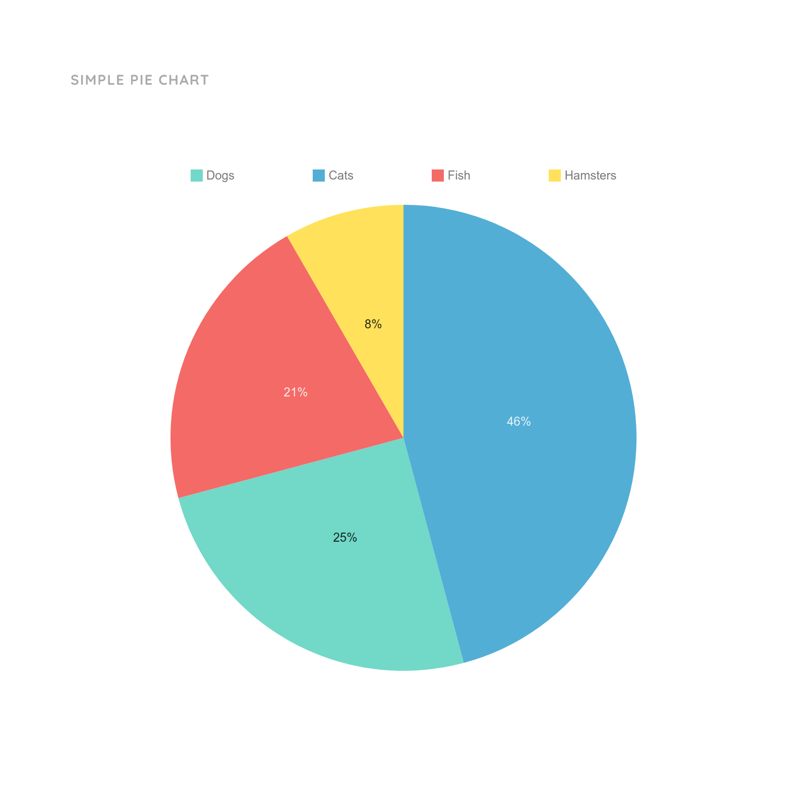
Example of simple chart
Fascinatingly, I can also include video and audio in the slides. I can include interesting videos and record my voice to be included as a voice-over. This may help to explain the details to the students and increase the interest level of the students as students' understanding is our priority as an educator. Not only that, but I can also create my animation into my slides. The process of creating may take some time but it is so easy to make. It kind of reminds me of how people usually create cartoon or stop motion video. I think this idea of animation definitely attracts the students to keep their focus on the Powerpoint and lesson.
Example of Powerpoint Animation
In a nutshell, I strongly believe that Powerpoint is a very powerful and paramount tool in teaching and learning process in the 21st-century class. There are a lot more functions and features that we should discover to have more functional and effective Powerpoint. Ultimately, this software will be my supreme tool as I can use it with wider functions.
The Beginner's Guide to Powerpoint
How to make Powerpoint Presentation Attractive
Special message :
Be careful. Always wash your hands and please stay at home.

Comments
Post a Comment